
2. How effective is the combination of your main product and ancillary texts?
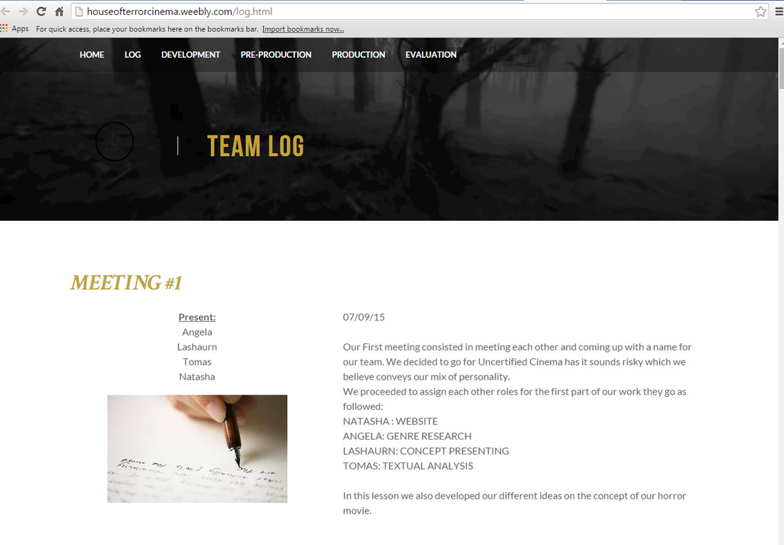
On this page we will be answering the second question question which is "how effective is the combination of your main products and ancillary text?" This page is where you will find us pulling apart all three of our media text and seeing the effectiveness of it together and across different media platforms. Our main focus would be on continuity as well as synergy. This page will answer:
1. The ways in which our products develop and challenge the conventions of real media products
2. The effectiveness of all three products and ancillary text
3. Information taken from the feedback given
4. The way in which we used media technologies in all the stages
1. The ways in which our products develop and challenge the conventions of real media products
2. The effectiveness of all three products and ancillary text
3. Information taken from the feedback given
4. The way in which we used media technologies in all the stages
Successful Real Media Text Examples
Synergy is very important as it is the stage where you get different entities and make them cooperate advantageously in order to get one final outcome. The outcome for this project/ in film is to build a brand and ensure that it is one that is recognisable against all media platforms weather it be a game, poster, merchandise or toy.
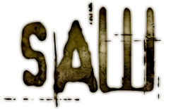
Below are photos from the movie SAW these are iconic symbols that build the brand for the movie. Seeing the clown (Jigsaw) automatically lets someone know that, that is where the character comes from without watching the actual movie. The Saw franchise has seven movies to it including one that was a remake of the original movie (2004 movie released in 2010). The Saw franchise has released one movie every year starting from October 2004 to October 2010. This is a great strategy as it helps form a steady following of the movie and contributes to causing buzz about the movie closer to the release date.
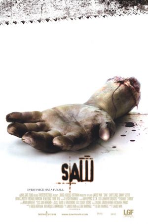
SAW
|
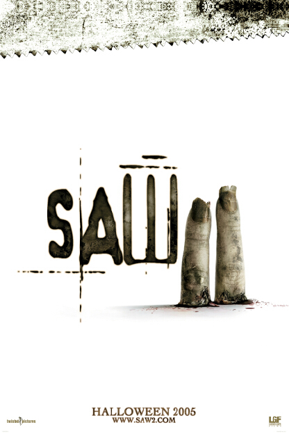
SAW 2
|
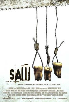
SAW 3
|
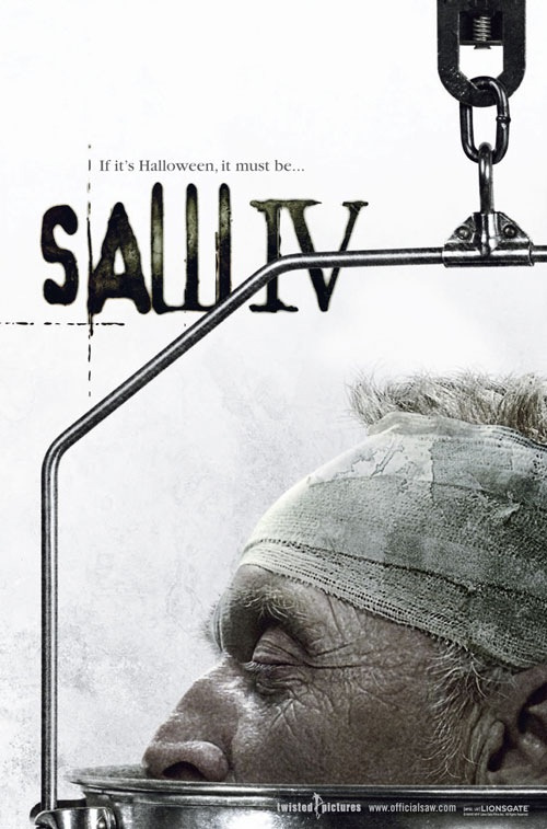
SAW 4
|
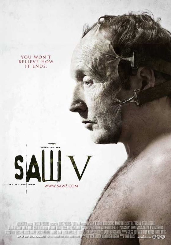
SAW 5
|
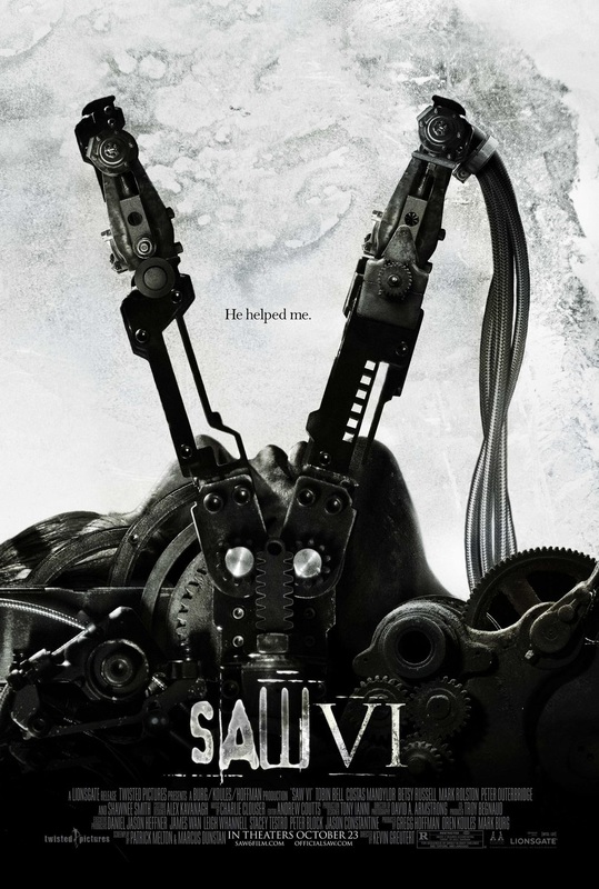
SAW 6
|
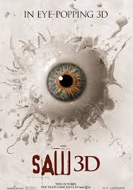
SAW 3D
|
Video Games
|
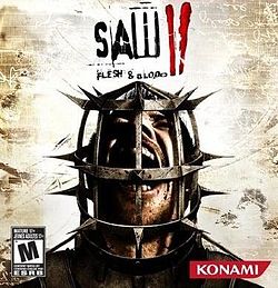
The rights of Saw's video game is owned by a successful Japanese game company Konami, this company had intentions of making a sequel of games that connect to the movie. The first game released was Saw II flesh & blood and was created for Play Station and XBOX users. The game was released in October 2010 ten days before the release of their seventh movie in the sequel (SAW 3D). This was done on pi to ensure that they coincided with one another.
|
|
Comic
|
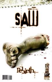
Asides all the other products that saw branched out and franchised with they all have a comic book, Saw: Rebirth. It was a prequel that for the original movie and was released to promote the release of the second movie in the sequel Saw II, however the story line was then contradicted in Saw IV.
|
|
|
|
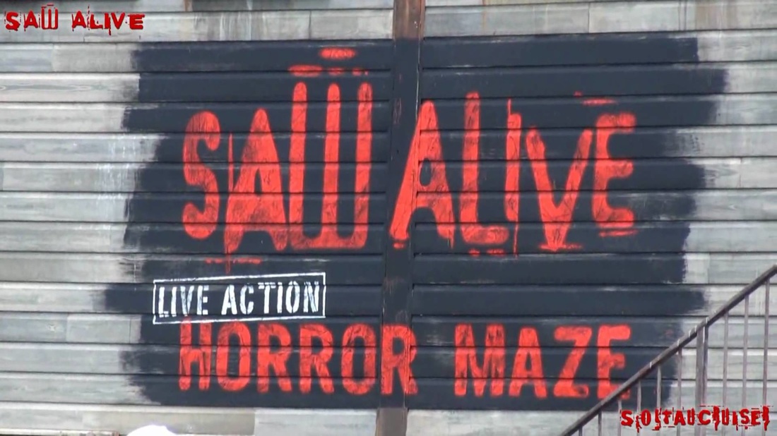
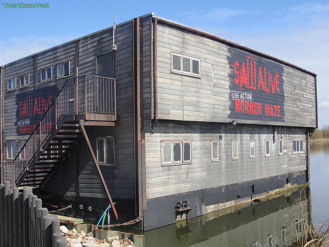
The Ride
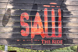
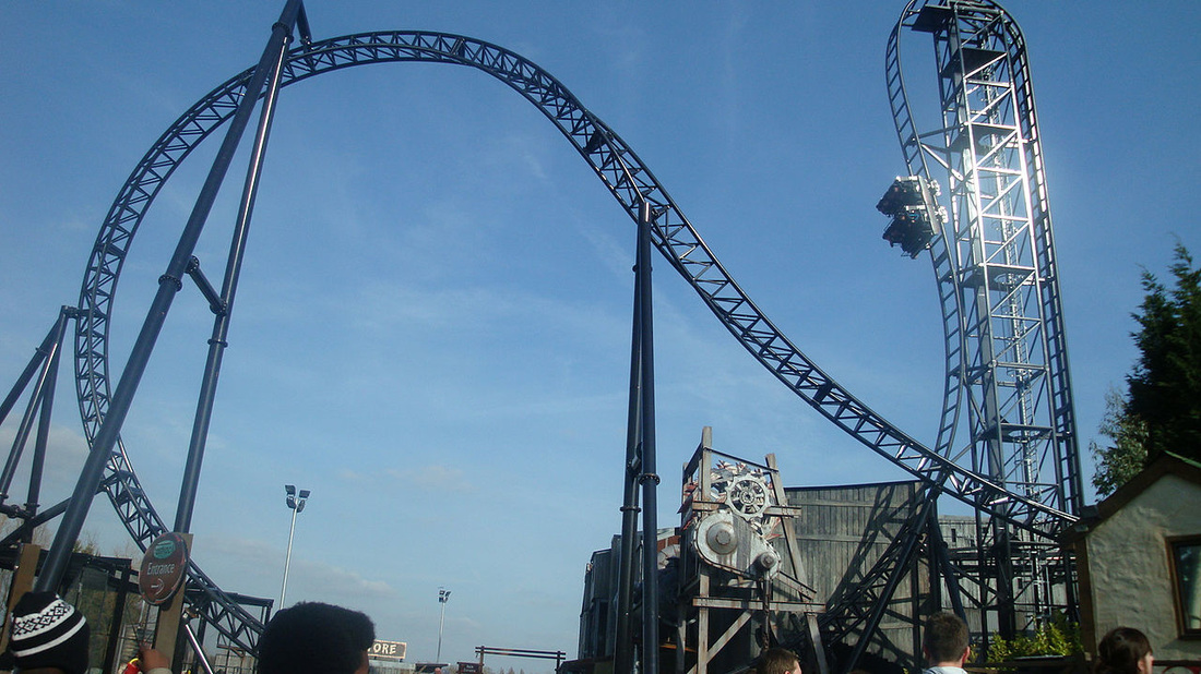
Saw Alive |
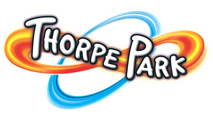
Creating Saw the ride is another strategy to franchise the brand. it is a custom euro-fighter roller coaster themed around the movie sequel. The ride was opened in March 2009 in Thorpe Park United Kingdom. It features an enclosed dark ride section with special effects, before cars travel outside and are pulled up a 100-foot vertical lift hill into a steep 100-degree drop.
|
|
In addition to Saw the ride Thorpe park later added Saw Alive to there list of activities in the park. Saw Alive is a live maze featuring one notorious scene from each movie the Bathroom, the Electrified Corridor, the Freezer, the Mausoleum Trap, the Pendulum Trap and the Carousel Trap. The maze is dark and relies on actors,make up, mist and smells to add realistic effects. The maze is known to become more scary during the Halloween period and Thorpe parks famous fright night.
|
|
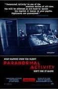
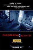
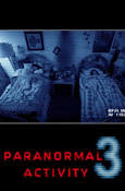
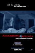
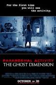
Below are the official posters for the movie franchise of Paranormal Activity. Paranormal Activity has the common colors of blue and red this it what forms to make the brand of this particular movie along with the CCTV theme around the images. There are six movies in this franchise and the main image for the print poster of the movie (exepct from one) are of CCTV images.
|
|
|
|
|
|
|
|
With recent speculation about a game to consign with the movie going around there is no official certainty that there will be a release. In the video there is a games v/blogger filming what they suppose the game will be like and what they think of it,
The game is still currently unnamed however it is believed that it should be out around the time of the next and final movie of the franchise, which is out in May 2016. The game is supposed to be similar to the movie and be a virtual reality experience. |
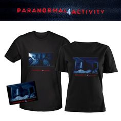
official merhandise
|
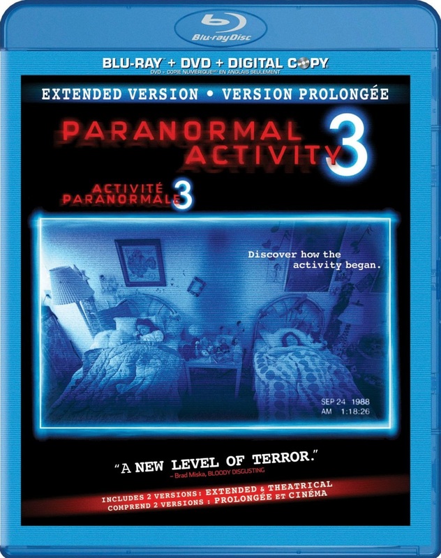
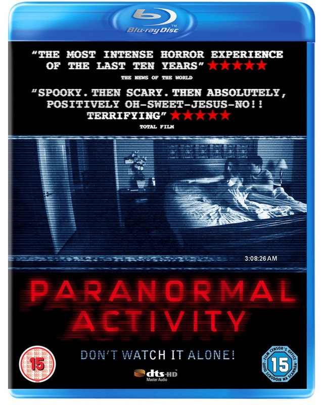
The Paranormal Activity franchise has also released certain movies in Blu ray These movies are usually advertised with having 'directors cut' and 'extended cuts' this is in the effort to entice the audience to buy it knowing they are getting something extra from it. It is not unusable for a fan to go and see the movie then go and buy it on bluray to get these special editions.
|
|
|
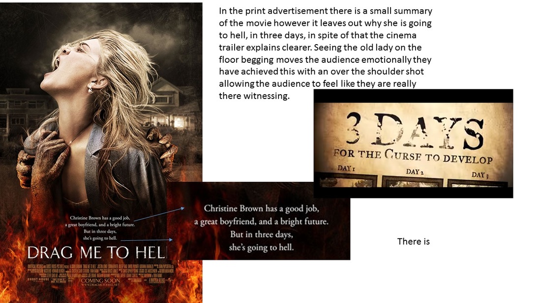
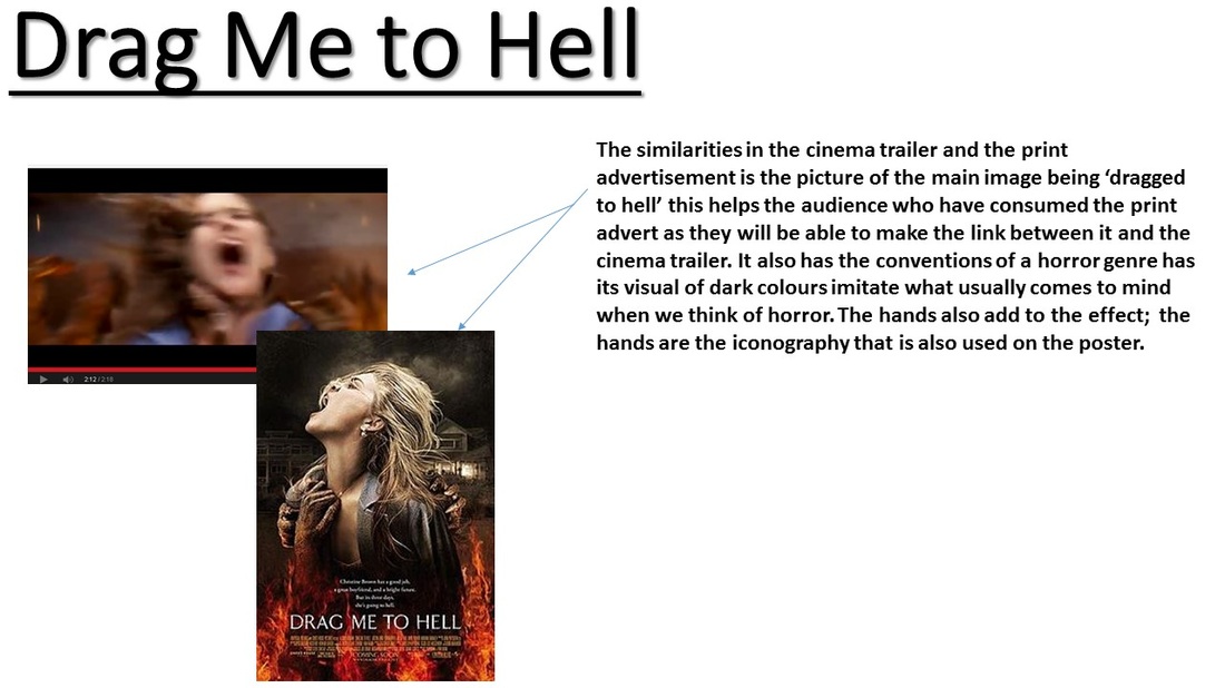
Trailer VS Poster
|
|
|
|
|
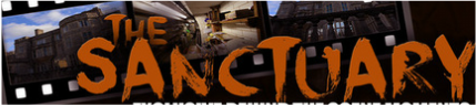
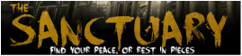
Title/ Typography
An important part of this assignment was ensuring that the fonts and color of the typography is consistent through out our three final pieces along with the website. The importance of this is it helps to build the brand's identity. The typography for our film title was consistent throughout all three of our final pieces. We chose to us the font DK face your fears which we got from dafont.com because it went along with our genre.
Magazine
The typography on the magazine is the second biggest size text on the page this is because it is the most relevant after the mast head. The typography has a warmer tone to it this was done to tie in well with the rest of the colour scheme on the magazine. The film title is the same font as the rest of the final pieces and the colour still correlates with the trailer and poster,
|
Poster
The typography for the poster remains the same font as the rest of the final pieces this is so that as soon as someone sees any of them they can automatically link it to the film.
|

Trailer
The typography at the end of the trailer, that shows the title of the film is also the same font. THe colour of it is also the same as the poster however the overlay effect on top of it allows it to appear a little more lighter.
|
Credits
Film Credits
|
Poster credits
|
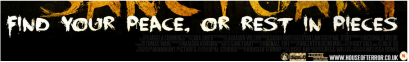
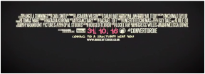
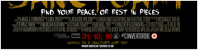
Banner
|
Another part of typography that is repeated throughout our final pieces is the credits. The credits feature on the official movie poster as well as on the trailer. On the movie poster the credits for the movie are shown right at the bottom and on the trailer it is shown right at the end. The trailer in both final pieces was white and consisted of the same font and information. In the banner the credits has the font and features as the other credits however the credits are in a darker colour, this was done because we expect people to be more familiar with the film so they already know what is written in the credits. This showed the correlation between the two it also showed the publishing house (us) 'house of terror' by putting in the logo.
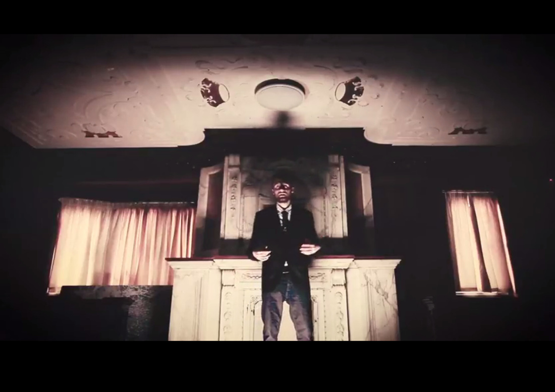
Antagonist
|
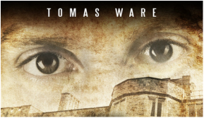
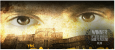
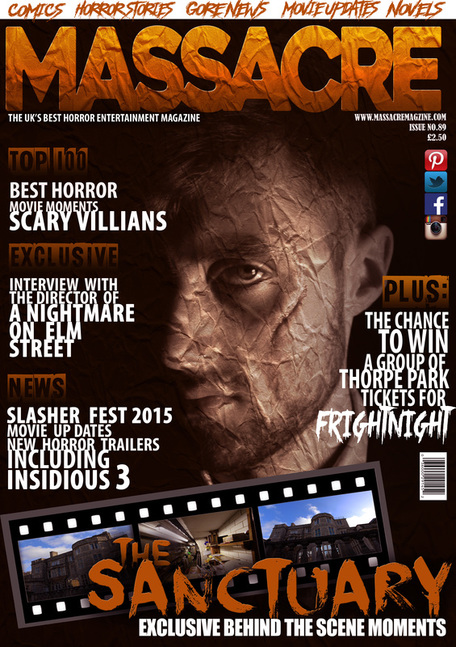
The antagonist used for our movie was Tom, this character is a significant part of the branding for our movie. The antagonist features in all three of our final pieces this is because he is the main character of the movie and through our audience research which was carried out in pre-production the audience said they would like to see him often throughout all three of the our final pieces. Both our trailer and magazine show the full face of our antagonist; in the trailer you are able to see the antagonist talking and moving this was done to build tension as the audience would get to know the antagonist a little better before watching the movie and it will also make them want to watch the movie. The main image of the magazine was the antagonist, Tom. This was done because that is the main image which was voted for in our audience research. Doing this will also pull in the target audience because they may be familiar with his face from watch the trailer which will pull them into wanting to buy the magazine. It will also entice a secondary audience who may be intrigued by the star quality as they may have seen him in other movies before or be fans. In movie poster the antagonist is only shown partially in the main image. We chose to only show the eyes of the antagonist above the main image to create suspense and make it scarier and connote to the sub-genre it belongs too. Rather than making the main focus the antagonist for the main image on the poster we chose it to be the building as the film is called the sanctuary it shows the sanctuary so it correlates together.
|
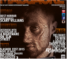
Magazine

Trailer
|
Poster
|
In the banner and the film poster the eyes are used as an iconic feature. This image shows the antagonist. Our reason for doing this is so that when people see the eyes they will instantly link it back to our movie. Both images have the same colour overlay and tint this also correlates with the colour of the typography.
|
banner
|
Team Logo
The team logo was created in photoshop and is used to show where the film is coming from. The team logo is visible in two of our final pieces the poster and the trailer. THe team logo is also shown in various part of the website like at the top of every page on the header of the website; the logo is also shown in the group photos and individual photos of each team member. This was shown to portray the unity in the group and to be consistent. In the beginning of the trailer the team logo appears before the trailer begins; this is the only time the team logo is a different colour as it has an overlay effect on it for creativity for the trailer. On the poster the team logo is amongst the credits at the bottom.
poster
|

|

trailer
|
website
|
Colour Scheme
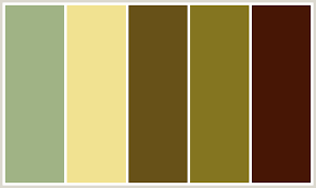
COLOUR SCHEME!! The colour scheme we chose to follow for our project was a khaki/yellow/orange with a black and red tint type. We chose our colour scheme based on our setting that we filmed our trailer in. The colour scheme is effective in the trailer, poster, website and magazine. There is a consistency in the colour scheme throughout all pieces however the magazine has a slightly more darker tint to it this is to go with the website along with the particular theme of that edition of the film magazine. The titles and subtitles on particular pages across the website consign with the colour themes seen on the magazine and trailer.
home page
On the home page where the project mark scheme is outlined there is a pattern of colours which is the same colour as the poster title.
|
Team Log
The title of the page for our team log also has the same colour of the film title on the poster, this colour is consistent throughout this page as it is done in a pattern alogside black.
|
Lighting
In this project the lightening used was low key this is because it helps to convey the particular genre of the project. The main image on the magazine has low key lightening to make it look more dark and misty this is the same as most scenes in the trailer, however the main image of the building on the poster was shot in high key lighting because of the time of day it was taken in essence to this the image was then manipulated in photoshop to make it look as if it had been taken in low key lightening this helps in allowing it to go along with the rest of the final projects and the website. The website features a lot of GIFs and images that have been taken in low key lighting this particular lightening helps support the genre of film we are promoting.
|
|
|
|
Synergy Through Different Platforms
Synergy: the interaction or cooperation of two or more organizations, substances, or other agents to produce a combined effect greater than the sum of their separate effects. In The case of our media project synergy is used across different platforms to create a combined effect for our film in general. We chose to portray these through our Trailer, Poster and Magazine front cover. However this will show how we tried to show it throughout other sources apart from on just media platforms.
Digiital Bilboard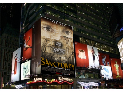
This image shows the movie poster being blown up onto a digital billboard, We chose to do this because it will be more interacting to see it shown like this rather than just on the paper. We did not adapt this poster and kept it the same as the original. This is so people grow familiar with it.
|
Piccadilly Circus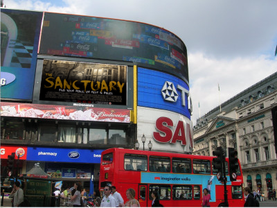
In this image our banner as been put up in Piccadilly circus, this is a high populated location in London it is also a major tourist attraction. The effect of having our banner put here is that it will capture not only the attention of the target audienc but also the secondary. The image for this was adapted and made smaller into a banner so it just shows the important information of the film.
|
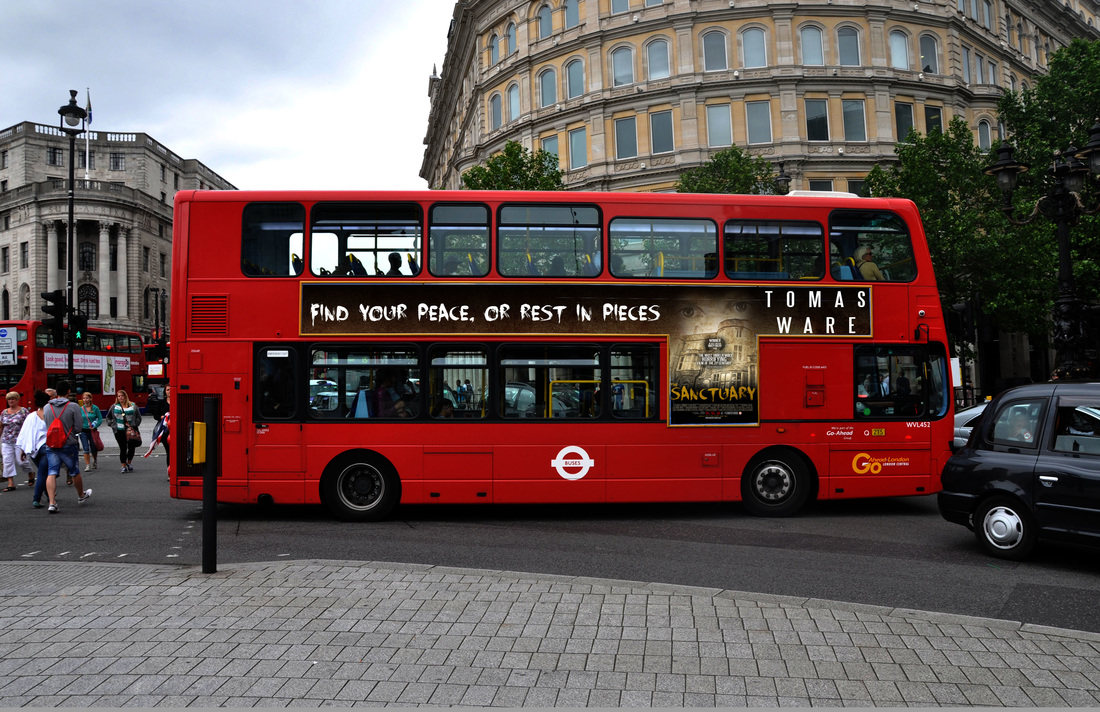
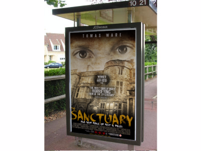
London Buses |
Bus Stop |
In this image our poster has been put onto a London bus stop. The effect of doing this is that it will grab commutes attention on their daily runs; doing this may also bring in a secondary audience because people who may not usually be interested in horror may be lured in by the poster.
|
The image above shows the movie being promoted on a London bus this is a very popular way of advertising in London. This banner was adapted so it is easier to read for commuters. For example 'Tomas Ware' is the star power so his name has been blown up big so his fans or people interested in him are altered immediately and would want to go on and research the movie.
|
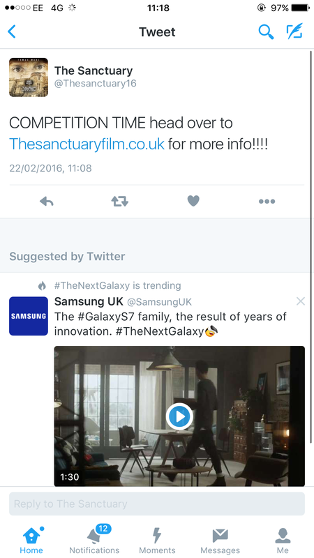
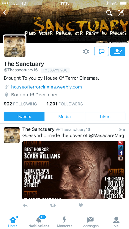
Twitter - Social Media
|
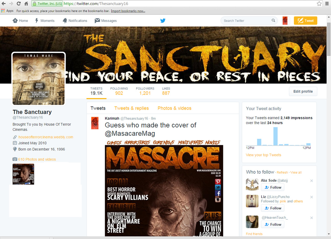
Another way to promote the movie was by creating a social media page. We decided to create a twitter account as it is a fast growing network that is used worldwide. Our decision to use twitter was also based on the fact that it is a social media platform that can also be found on mobile phone apps along with smart TVs.
|
|
Netflix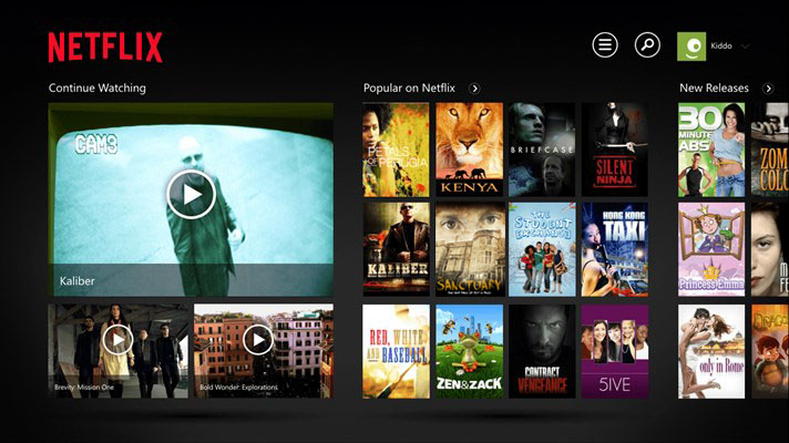
|
We also decided a good way to release the film would be onto Netflix. Netflix is a popular website that is used worldwide to stream many different movies with a monthly fare. We decided that in doing this it will create an enhanced viewing experience for the viewers and will also help tackle and cut down on things like privacy because it will be easily accessible for the audience.
|
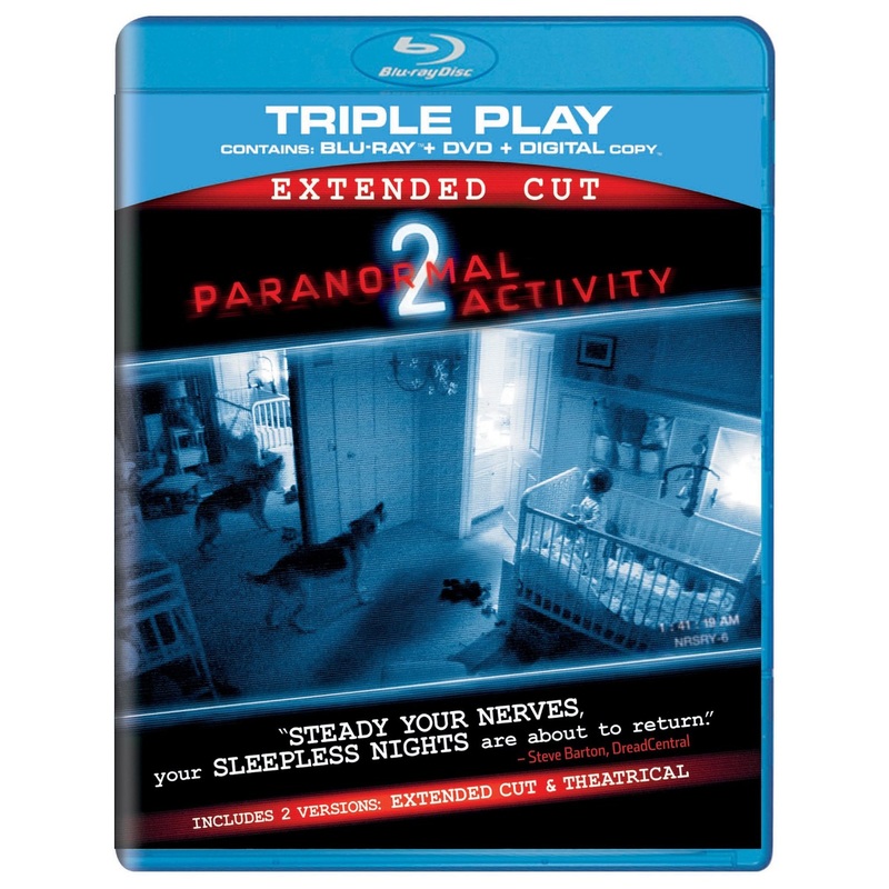
Blu-Ray Disc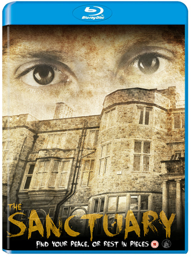
Along with Releasing the film on Netflix and DVD. We also decided that it would be great if we branched out and released a version on blu-ray this also contributes to having an enhanced viewing experience at home. The Blu-ray will also have features on it that can only be found on the blu-ray disc.
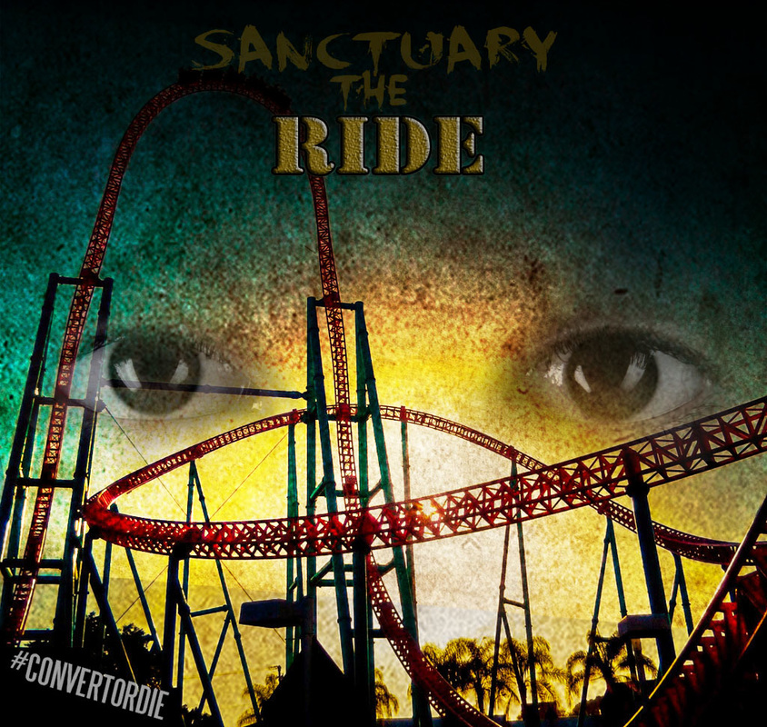
Theme Park Ride |
Game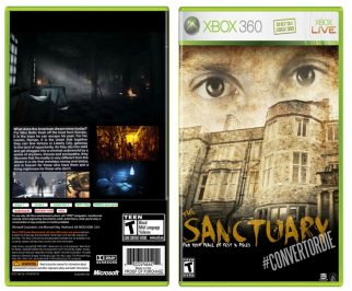
We also chose to create a game that will be released on the XBOX, this game should be released the same week as the release of the blu-ray DVD this will help create a buzz about the movie. It also helps create the cross media convergence as it is a gaming console mixed with an XBOX. The blu-ray disc will also be able to be played on the XBOX console. Alike the blu -ray cover and three final pieces they all have the same font in common.
|
|
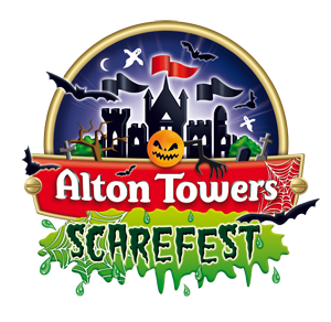
In addition we also developed a ride for the film. In the image that is what we would like the ride to look like and the image is an idea of what the advertisement for the actual ride would look like. The kind of theme park we would like our ride to featured in would be Thorpe Park we came to this desicion because Thorpe Park is known to have previously put in rides that are adapted from a movie for example SAW the ride. Another theme park we thought of was Alton towers because they also do film based rides like their Thirteen/Scream ride.
|
Conclusion
To conclude question two, I believe that in order to make the main products work together and be effective there needs to be consistency throughout all the things done. This includes the website, Trailer, Magazine and poster. Simplify having something like a consistent and noticeable colour scheme allows us to build a brand and it helps in making our final products noticeable to not only the target audience but also the secondary audience.
Through the use of analysing different real media text it helped contribute to this conclusion. Looking at them helped us to understand the different stages of building a brand and the effectiveness that our work can create when all our products are put together.
Doing this research helped us expand our own product through cross media convergence and also synergy. Creating different experiences that link with our products helps to advertise and create a buzz about our film it will also be a good source of revenue having all the different platforms promote.
