
INTRODUCTION
Here we have collected opinions from our target audience about the strengths and weaknesses of all 3 of our final pieces, and also gained some feedback from what the audience would have improved. We've used a range of social media such as Snapchat, Whatsapp, Twitter and Facebook to interact with our target audience to ensure we have met their requirements. Our target audience is rom 15+ both teenagers and young adults.

|
I'm Facebook is an online social networking site founded by Mark Zuckerberg which was launched in February 2004, along with his Harvard college room mates. After registering to use the site, it then allows users to create a profile, add other users as friends, exchange messages, post status updates, upload photos, share videos, use various apps and receive notifications when others update their profiles. Facebook can be accessed through the computer, android and apple devices.
|

|
Snapchat is a video messaging app created by Evan Spiegal and Bobby Murphy when they were students in Stanford University. This app allows users to take pictures, record videos and add text and drawings to it. Users can set a time limit for how long they want recipients to view their snapchats (from 1-10 seconds). Using snapchat to gather audience feedback will also allow us to know how many people have contributed and viewed the snapchats.
|

|
Whatsapp messenger is a cross platform messaging service for smartphones. It uses the internet to send text messages, images, videos, user location and audio media messages. The service was founded in 2009 by Brian Acton and Jan Korum (both former employees of Yahoo). Whatsapp is a very useful social media source as it will allow us to send the link of our survey to multiple people at once, this app would also let us create a group chat up to 100 people, we could then discuss our final pieces as a whole and gain a range of feedback at once.
|

|
Twitter is an online social networking service that enables users to send and read short 140 character messages called "tweets". Registered users can read, post and re-tweet, tweets as well as exchanging media formats such as videos and images. Users can access twitter through the website or mobile device app. Twitter was created in March 2006 by Jack Dorsey, Evan Williams, Biz Stone and Noah Glass. Twitter is a popular social media where we will find our target audience as most young teens and adults use Twitter.
|
|
Survey monkey is an online survey company, founded in 1999 by Ryan Finley. Survey Monkey provides free, customizable surveys, as well as a suite of paid back-end programs that include data analysis, sample selection, bias elimination, and data representation tools. We used Survey Monkey to make our survey in order for us to gain feedback from our audience.
|

|
YouTube is a video-sharing website headquartered in San Bruno, California, United States. The service was created by three former PayPal employees in February 2005. The site allows users to upload, view, rate, share and comment on videos, available content includes video clips, TV clips, music videos, movie trailers and other content such as video blogging, short original videos, and educational videos.
|
30 Questions Asked for Audience Research
Below are the 30 questions for the poster, magazine and trailer, we would be gathering some audience feedback using these questions that we made up. We tried to make them close end with some open ended questions so that the feedback is more useful to the team. We also tried to make up a various of different questions that apply to each three pieces, so that each of them haven't been repetitive.
|
Poster
1. After seeing the poster would you go and watch the film? 2. What sub-genre do you think the poster is portraying? 3. What would you do to improve this poster? 4. What is your favourite feature/convention on the poster? 5. Is the poster portraying the theme of horror? 6. Do you think the main image is scary/effective? 7. Do you think the colour scheme of the poster is appealing? 8. Do you like the typography chosen for the title and other texts? 9. Can you spot continuity between the poster and trailer? 10. What do you rate this poster? |
Magazine
1. Is the font used for the masthead effective? 2. Do you think the colour scheme works well? 3. Does the magazine compare to other existing horror magazines? 4. Would you purchase this magazine? 5. Does the magazine make you more interested in the movie? 6. Is there a continuity between the magazine and poster? 7. Does the main image fit the layout of the magazine? 8. What convention grabs your attention the most? 9. Do you feel like the typography used on the magazine conveys the horror genre? 10. Is there anything you would improve? |
Trailer
1. Do you think the captions used in the trailer were effective and created tension? 2.What element did you like the most? 3. Was the sound intriguing and gripping? 4. Was you able to identify the antagonist from the protagonist? 5. Do you think the trailer is similar to other real media texts? 6. Do you think the shots used in the trailer were aesthetically pleasing? 7. Would you watch the movie if it was released in cinemas? 8. Did you understand the narrative? (Was the story clear?) 9. Was the trailer engaging? 10. Do you feel that the pacing of sound generates suspense and fear? |
|
Cover lines
The cover lines on the magazine page had to also be as effective just like the masthead and main image. We worked well with the positioning and spacing of each different cover line to make it look professional and not messy.
Magazine Title
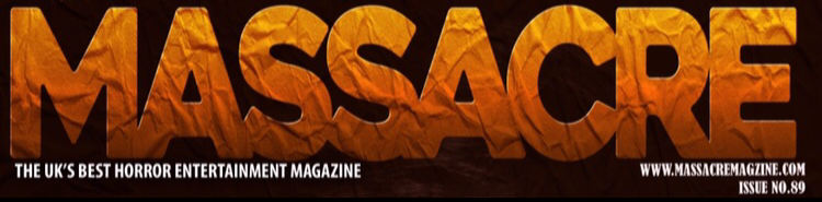
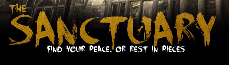
We chose for the magazine title to be called 'Massacre' This was something we did change as we went along with this project. The effect on this we tried to make it similar to the effect on the main image on the magazine so there was consistency.
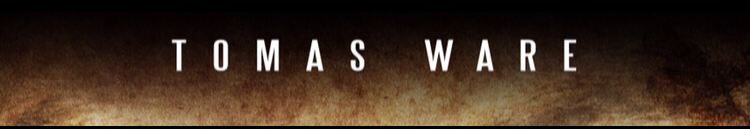
Film Title & Location Images
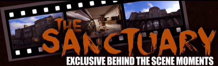
As every other magazine we had to promote the name of the trailer on the magazine in order to let the audience know they belong to the same franchise. We decided to place it at the bottom of the page along with the location we filmed our trailer at.
|
Magazine Main Image
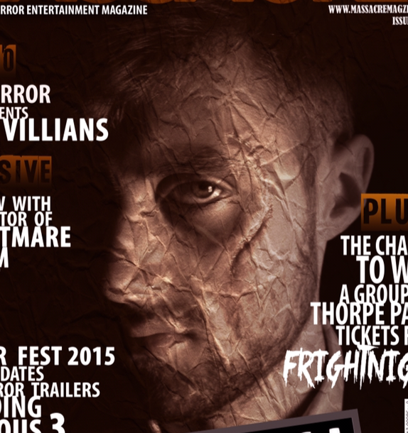
This is the main image of the magazine, we created the same effect that there was on the magazine title so the page looks consistent and not full of different effects. This really made the main image come alive more and look more interesting
Cast Name
At first we placed all cast names on the poster, as we started editing and positioning conventions around the page we thought to only put the main character on the poster. We placed it a the top of the page as this way worked better with the main image.
Awards
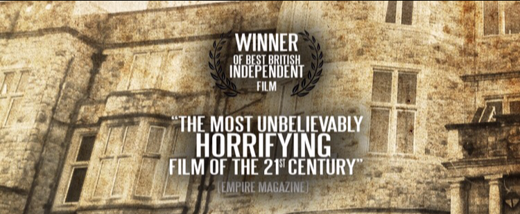
These were the only awards we used for the poster which was positioned in the middle of the poster, we didn't want too many because we didn't want to overcloud the page and cover up the main image.
|
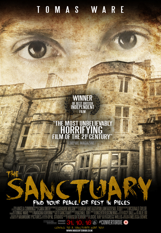
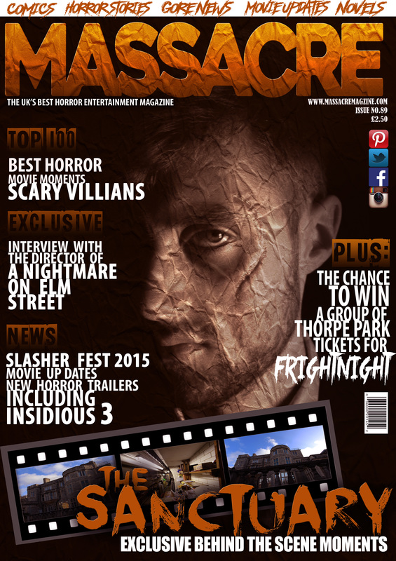
Poster Main Image
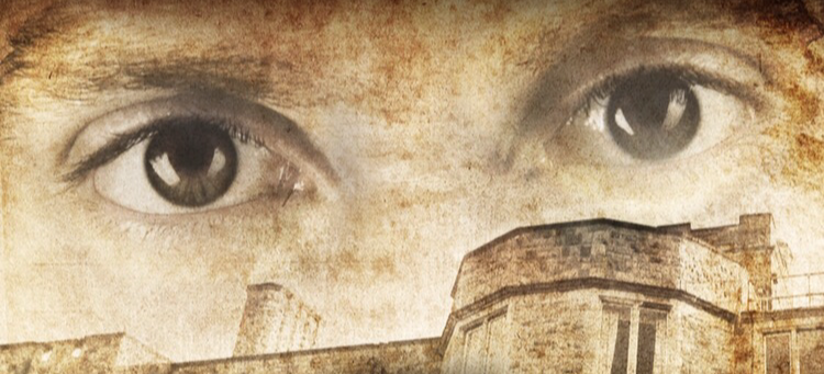
Here is part of the main image for the poster, before it was just a picture of the location we filmed in which was the house, we decided to then add in the eyes of the antagonist as we thought this would be more effective and portray our narrative better.
Poster Credits
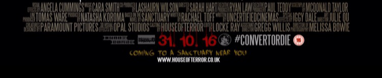
These are the credits of people that took part in the movie trailer, it's placed at the bottom of the poster page along with the release date and other production logos.
Film Title on Poster
This is the film title on the poster, we tried to make the title as effective and appealing, an effect that portrayed our sub genre and would stand out on the poster especially because of the colour effect.
|
Overall Response Feedback
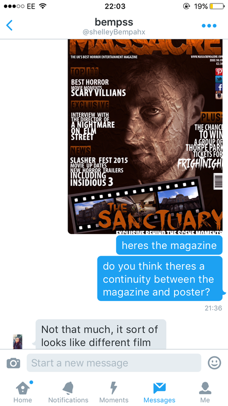
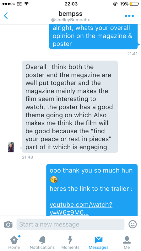
Below is some overall feedback from our target audience. We got a lot of different responses and most were positive, a few improvements we could have done to make the poster, magazine and trailer more satisfying. From this what we have learned is that as a whole there is a continuity between the magazine and poster because of the main image. From the results just from the poster most said they will see the film even without seeing the trailer, from the magazine it made them feel more interested in the film, and from the trailer most said they will see Sanctuary if it released in cinemas. This proves that all our final pieces were a success and managed to compare to other real media texts.
|
|
|
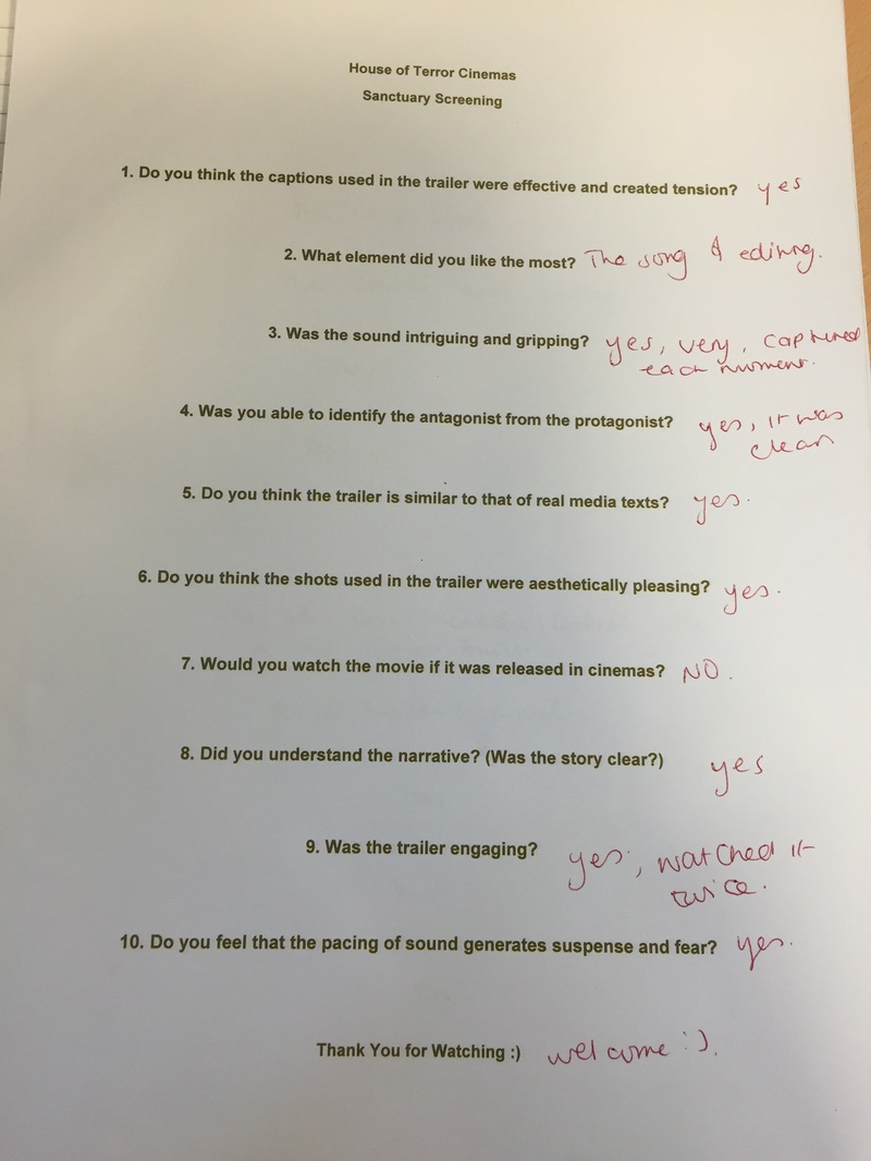
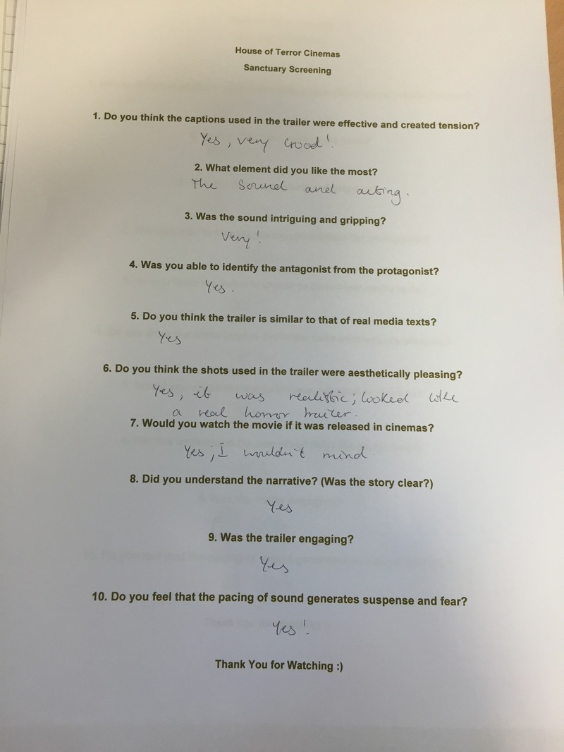
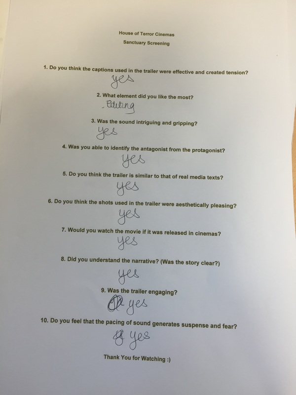
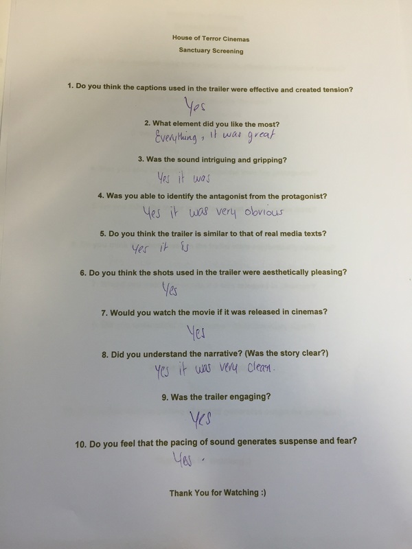
SCREENING
Here are the results from our screening we done for the trailer, we gathered a small audience to view our trailer, we them asked them to complete the survey. This helped a lot because this was a way of gathering more results in a different way.
|
|
|
|
|
Poster Results
Below are the results gathered in for the poster, we asked a multiple of different questions that the audience could easily answer, and would be beneficial for the group as a whole to see what was most successful and what we could have done differently.
|
|
|
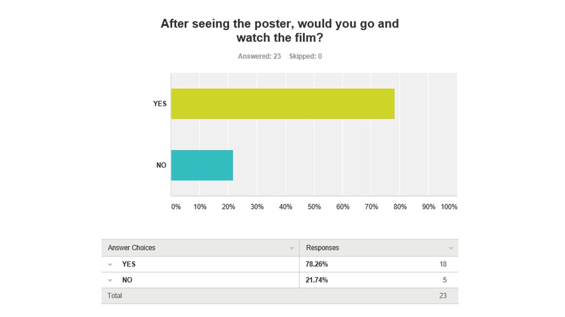
From the chart 18/23 people said that they would go and watch the film after seeing the poster. This shows that the poster looks professional and sophisticated just like a real media text poster.
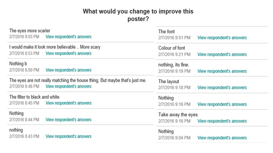
We got a few different responses for question 3 as we wanted the audience to be critical with our work. This question was about improvements that would have made the poster more scary/ fit with the sub genre.
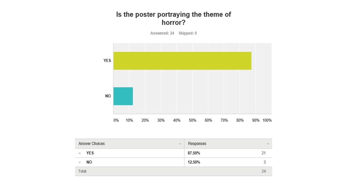
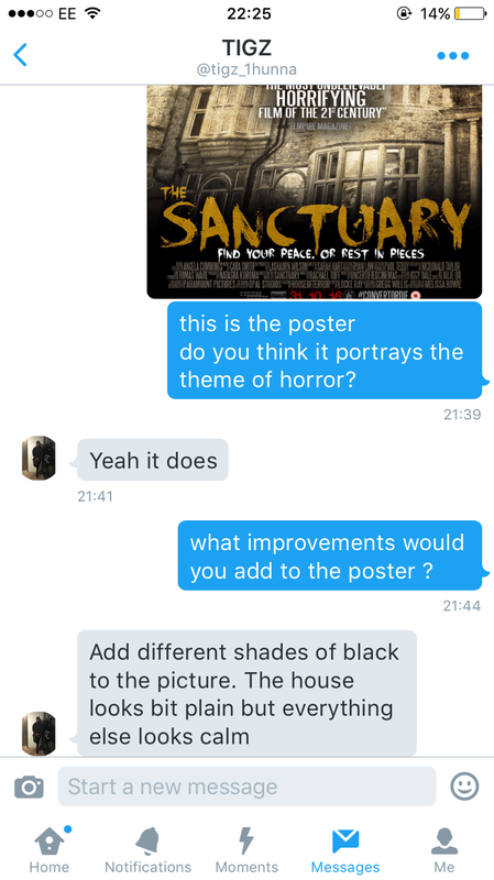
In this question we asked the audience if they thought our poster portrayed the horror theme, majority which was 21/24 voted yes. Therefore our poster was successful in portraying the horror theme which is what we wanted to get across as our sub genre is psychological.
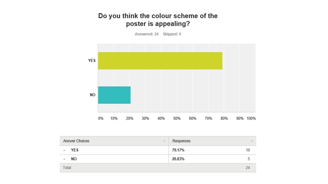
The colour scheme was a feature we had to consider very much throughout all three final pieces so the audience knew it belonged to the same franchise. Overall majority of the audience 19/24 voted yes that the colour scheme of the poster was appealing.
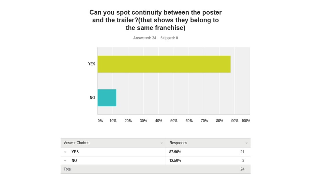
It was great to see that 21/24 voted yes that they could spot continuity between the poster and the trailer, meaning that we had elements from the poster that was recognised in the trailer to make it known that they belong to the same franchise.
|
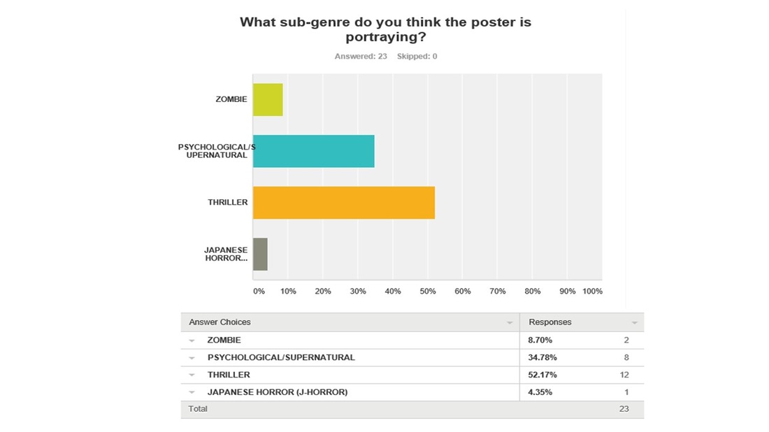
This was our 2nd question we asked in the survey, we asked the audience what sub genre they thought the poster portrayed as you can see 12/23 voted thriller, though our sub genre was psychological, therefore we may have not portrayed our sub genre as clear as we should.
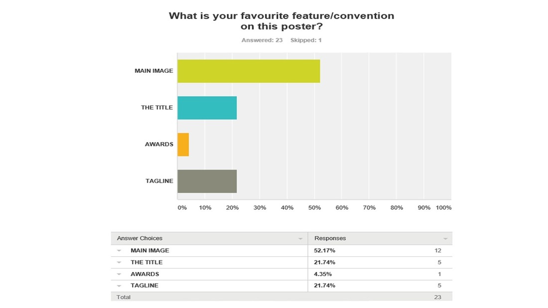
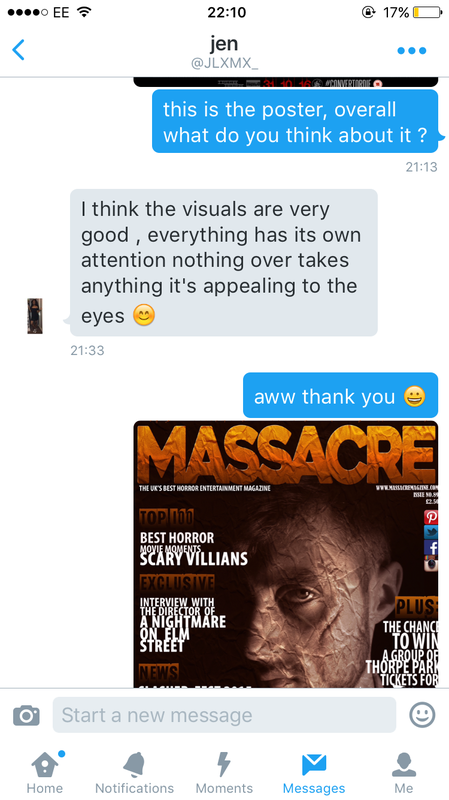
For question 4 the audience had more options to chose from as we wanted to know what their favourite feature/convention was on the poster. The most favourable was the main image as it got a vote of 12/23. This helped us to learn that the main image was a success and was the most effective feature out of all the conventions on the poster.
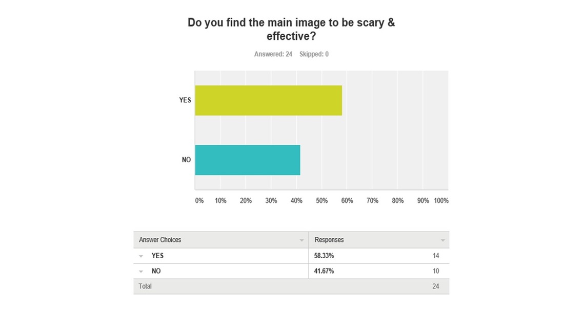
Our 6th question asked the audience whether they thought the main image was scary and effective, majority voted yes but it was very close to the amount of people who voted no. What we have learned from this is that following the horror genre we could have probably improved the lightening on the main image to make it more horror based.
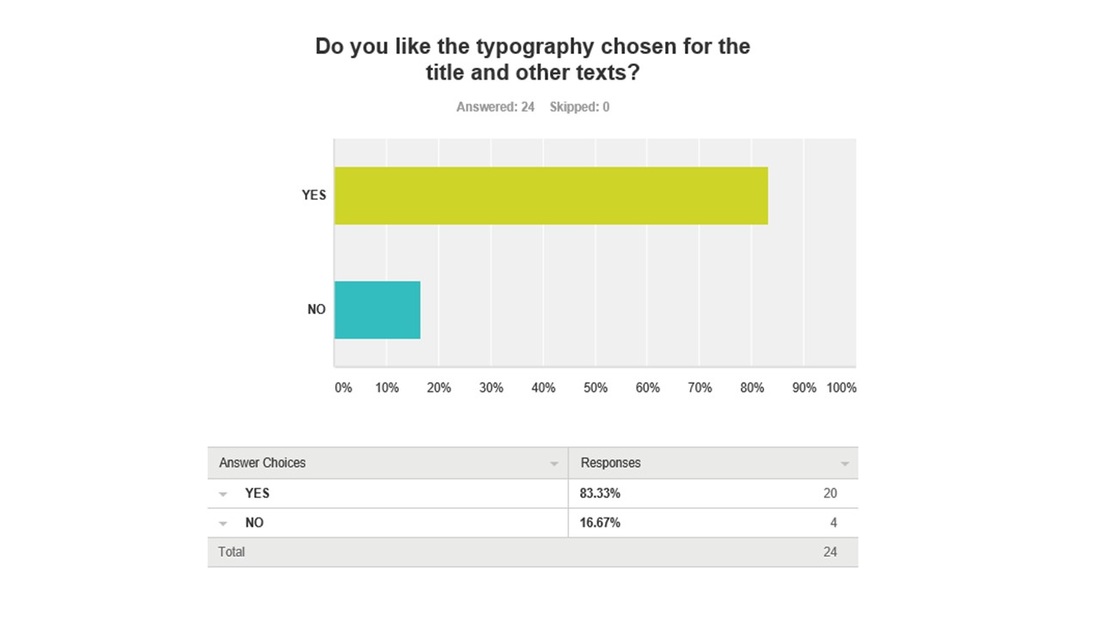
The typography chosen for the title and other texts, 20/24 voted that they liked the style chosen. What we've learned from this is that we have been consistent with the typography so it looks official and not having so many different fonts on the poster.
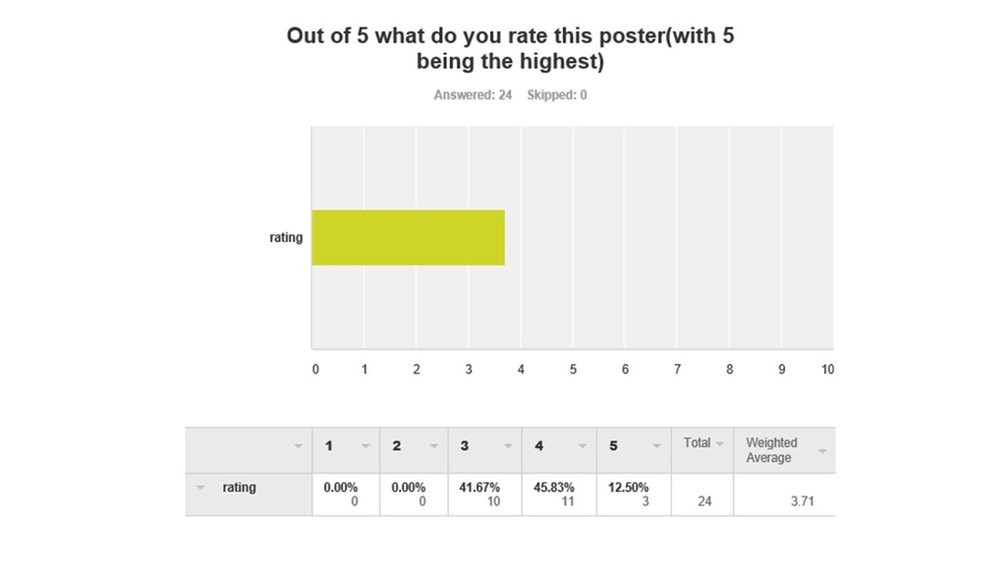
Question 10 was about the audience rating our final poster piece out of 5. We was looking for 4s and 5s and majority votes that the poster was a good 4/5. Here shows that the poster was a success.
|
Magazine Results
Below are the results for magazine here we asked 10 questions that were different from the trailer and poster. We also kept these simple and easy to answer so there weren't any misunderstandings.
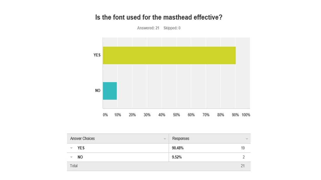
For the magazine we wanted to make the font that was used for the masthead different, bold and unique compared to the other texts on the page. We managed to get this across as 19/21 voted that it was effective.
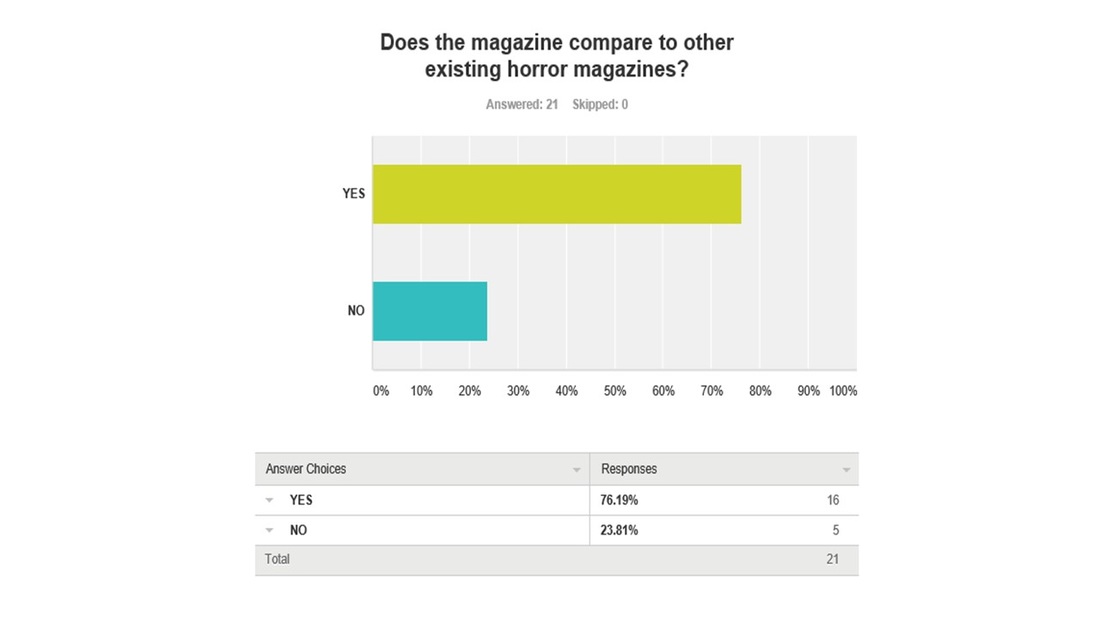
For question 3 we asked a question that would help us know if our magazine compared to other existing magazines. Only 5/21 voted that they don't think it compared to other existing horror magazines. Whereas 16 voted that it did, as a whole we tried to give the magazine a horror but an effect that portrayed our sub genre. We looked at other horror magazines so that we could use it for inspiration.
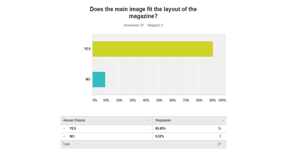
With the main image fitting the layout of the magazine, we edited a lot in order to make it fit around the main cover line, other cover lines, smaller images and the masthead. We focused on it so that it looked smooth and not as if all the conventions on the magazine were building on top of each other. 19/21 voted that it fitted the layout of the magazine.
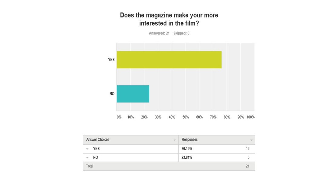
We wanted to make the magazine more exciting and creative so that the audience will feel more interested and intrigued to seeing the film. Majority which was 16/21 voted that the magazine made them more interested in the film.
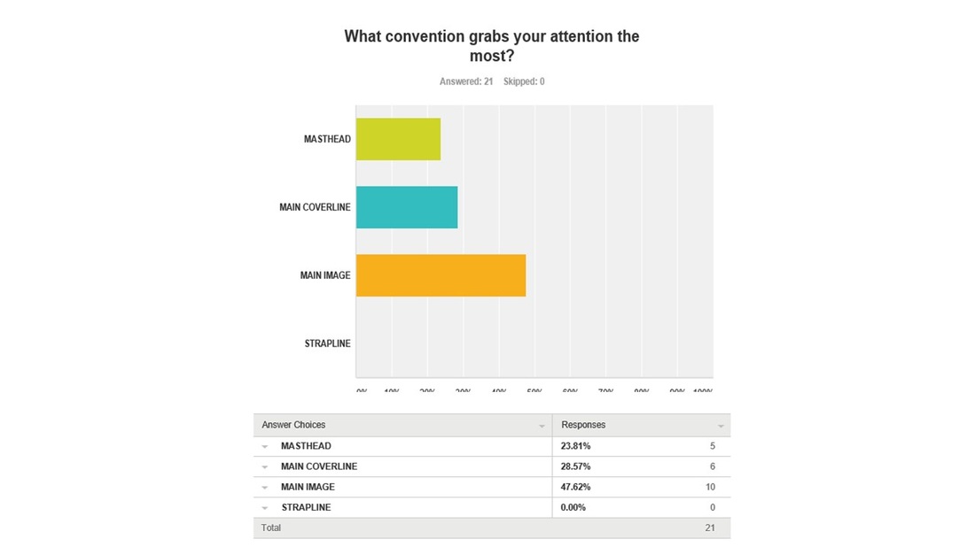
There was mixed feedback on question 9 as we gave the audience some options to chose from as we was interested in knowing what convention they thought grabbed their attention the most. With 10/21 they thought that the main image was the convention that grabbed their attention the most.
|
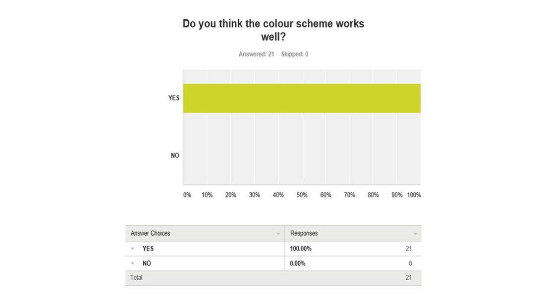
The colour scheme of the magazine was kind of followed by the poster, but we also tried to make it different. Everyone that took part in the magazine survey voted that the colour scheme for the magazine works well.
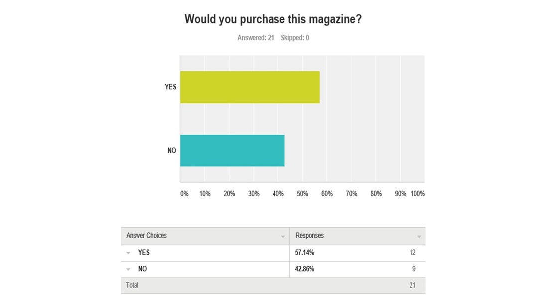
It was a close tie between the audience deciding whether they will purchase the magazine if it was in shops or stores. We tried to make this as effective as possible so that it looked like a real horror magazine.
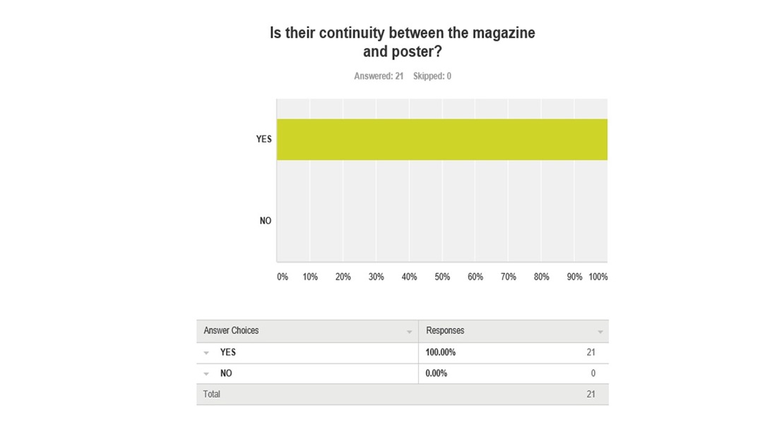
Everyone that voted in this question said that they saw a continuity between the poster and magazine. This was another success for us as we set out for the audience to see the continuity between both magazine and poster. Overall we feel that this has helped us learn from identifying continuity with existing magazines and posters.
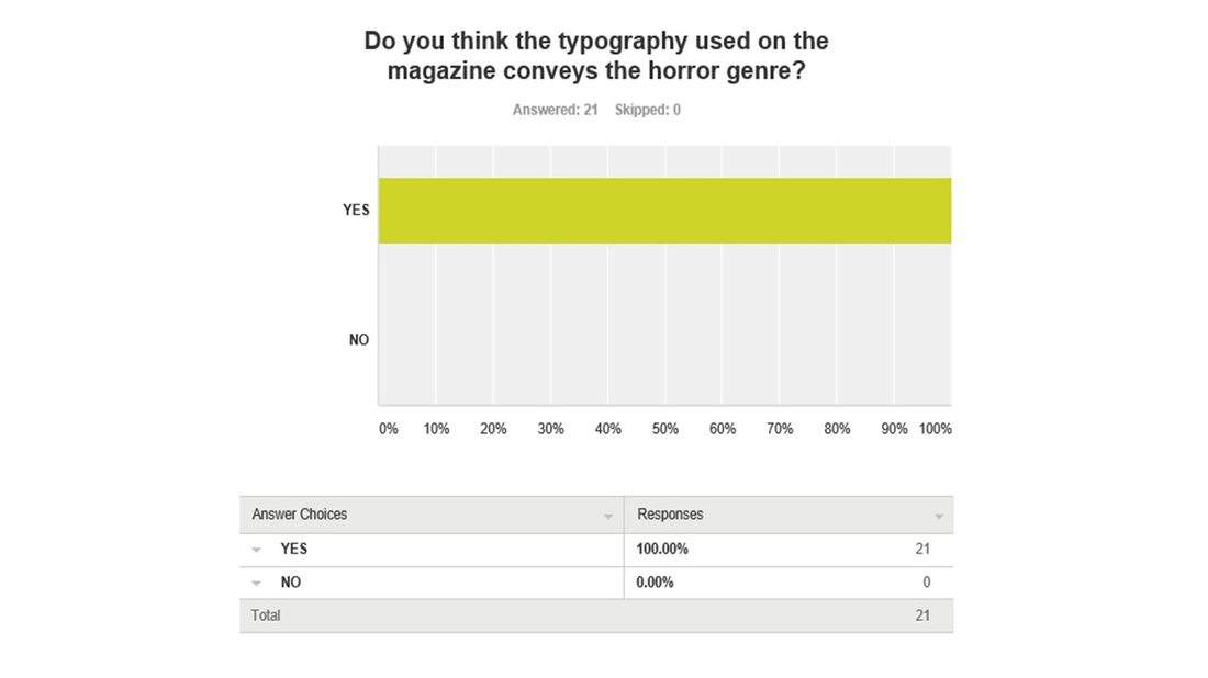
Everybody that voted agreed that the typography used on the magazine conveys the horror genre. We wanted to make the typography for the magazine more effective and alarming than the poster.
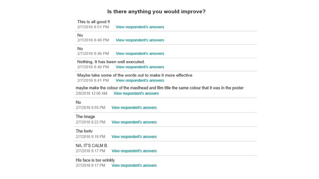
This was the last question we asked for the magazine, we wanted to make it a mixed answer response so we could get a taste of what our audience would do differently and how they would improve anything on the poster.
|
Trailer Results
Below are the results for the trailer gathered from our target audience, the questions asked here were more detailed as we asked about the sound, editing and the narrative of the trailer so we got an insight of what the audience thought about on all three elements.
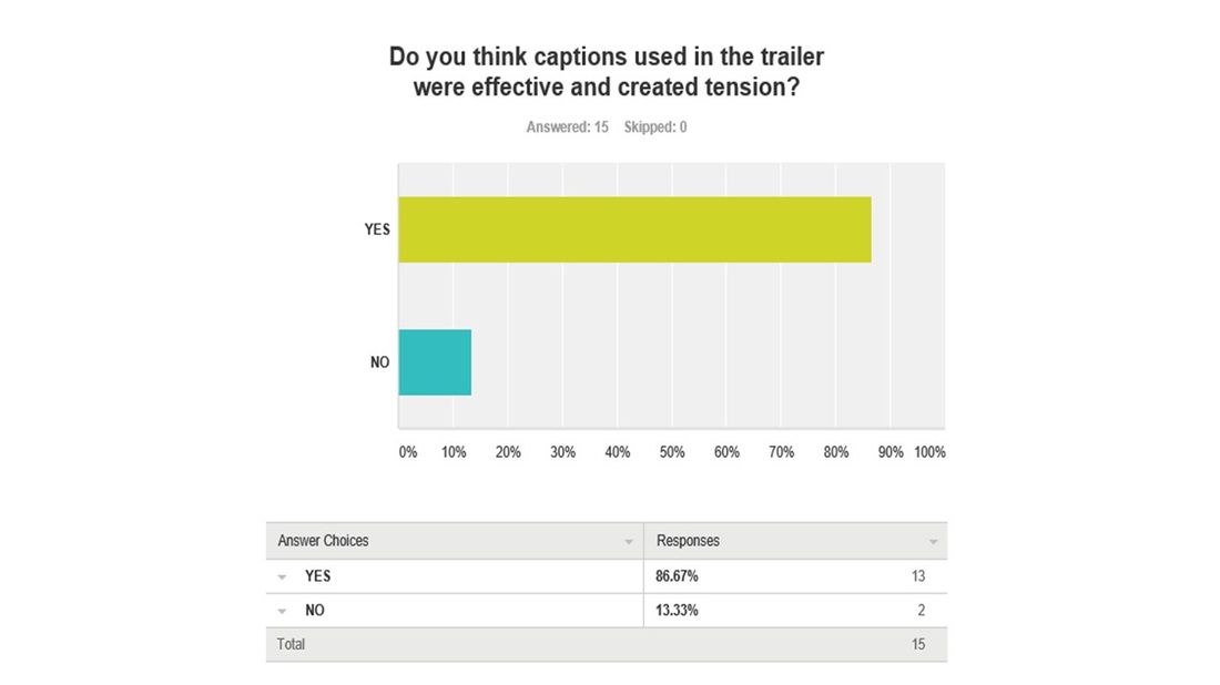
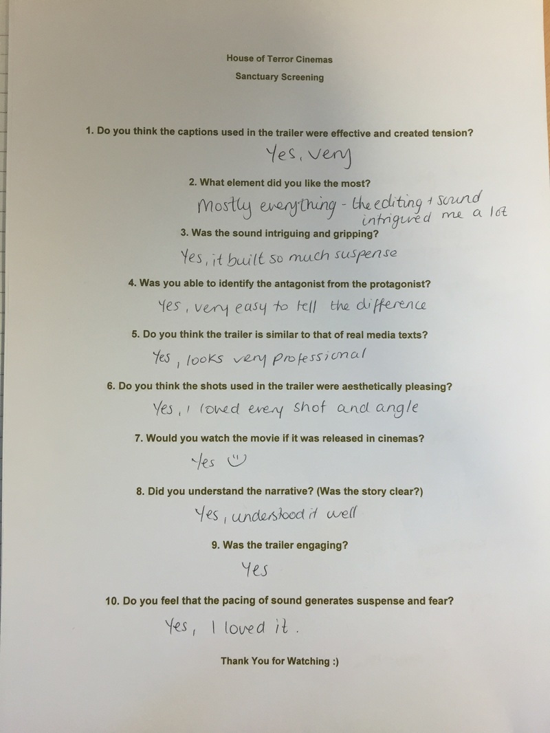
Majority of the feedback for question 1 in the trailer survey said that the captions used in the trailer were effective and created tension. Therefore this was a success for us as we tried to create sense of enigma in the trailer.
|
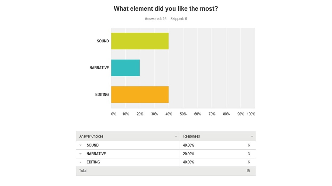
For question 2 there were mixed answers for this as editing and sound came to a tie. This was interesting because we worked hard in all three of these elements in order for the trailer to be up to standard.
|
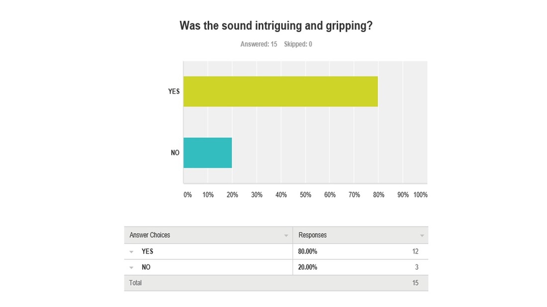
Working with sound was a big challenge for the group as we made sure we were as professional with it, getting it to fit in with the trailer at the right time. We tried to make the sound as satisfying and it was good to see that majority of the audience voted yes for the sound being intriguing and gripping.

As a whole we wanted our trailer to look well qualified and skilful, we spent a lot of time analysing and comparing our ideas to other existing horror trailers, this also gave us inspiration of what to do and what not to do. So knowing that 13/15 of our audience voted that it was similar to other real media texts was good even though we did try to make it different and unique.
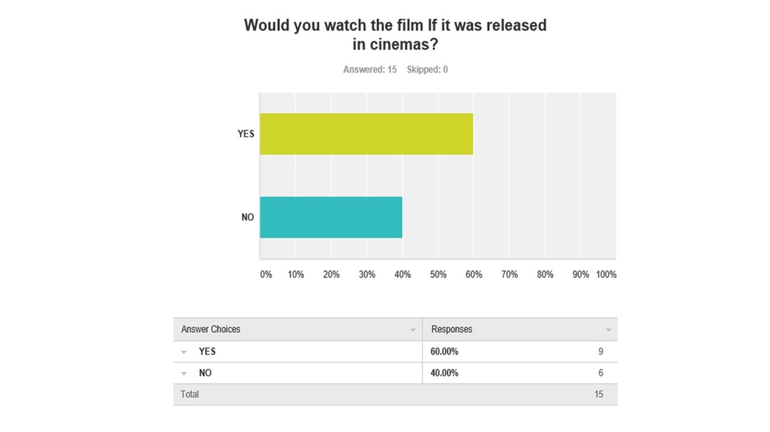
We wanted to know if our trailer was up to standard and asked the audience If they would watch the film if it released in cinemas, 9/15 said that they will watch it, tells us that our trailer was convincing enough.
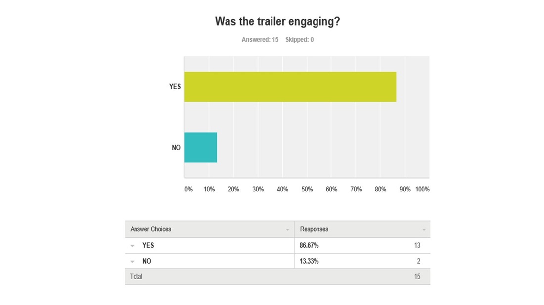
We tried to make our trailer as engaging as possible and it was a success to see that majority of the audience thought that the trailer was engaging and enjoyed it.
|
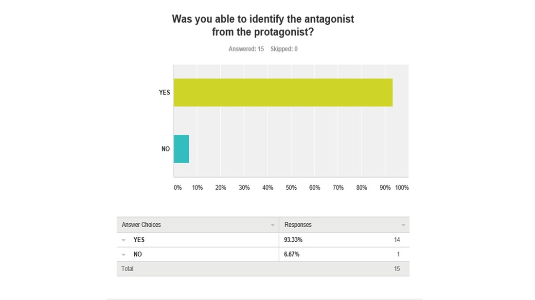
Overall 14/15 voted that they were able to identify the antagonist from the protagonist, it was only right for us to make sure it was clear that the antagonist was different from the protagonist an we tried to express that through the acting of the characters.
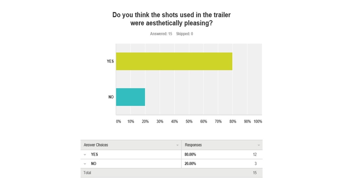
We focused well with the different camera shots we used and thought about how pleasing they will appear to the audience. We wanted to get as many different shots and angles so it will be more visually engaging to watch. 12/15 voted that it appeared aesthetically pleasing.
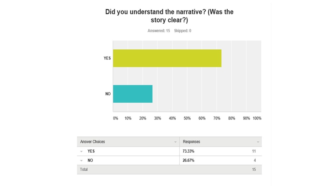
As a group we went through many storylines that we could possibly base our trailer around. When we finally came to our choice we made it as understandable as we could so that the narrative was clear and easy to follow.
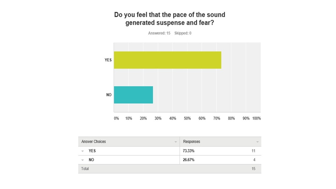
We wanted to create a lot of suspense and fear from the sound used in the trailer. Making a horror trailer we tried to generate this and build up that suspense so the audience could feel that type of atmosphere.
|
CONCLUSION
Overall what we have learned throughout this project and creating all three of our final pieces was getting the audience feedback from the poster, magazine and trailer. Gaining all these responses helped us see what we could have done differently and what we could have improved. It was a huge success as majority of the answers were positive, we did ask a few open ended questions at the end of each survey to see what the audience would have done if they were to carry out this project and how it will be different to what we done. As a group and working in a team so much effort was put in and we were more than happy to see that the audience enjoyed the progression of our final outcomes.
